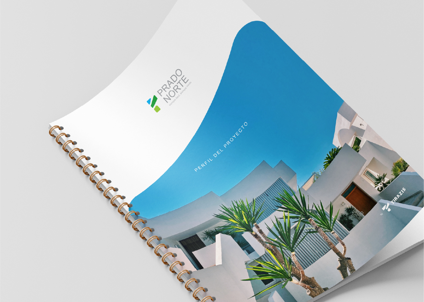
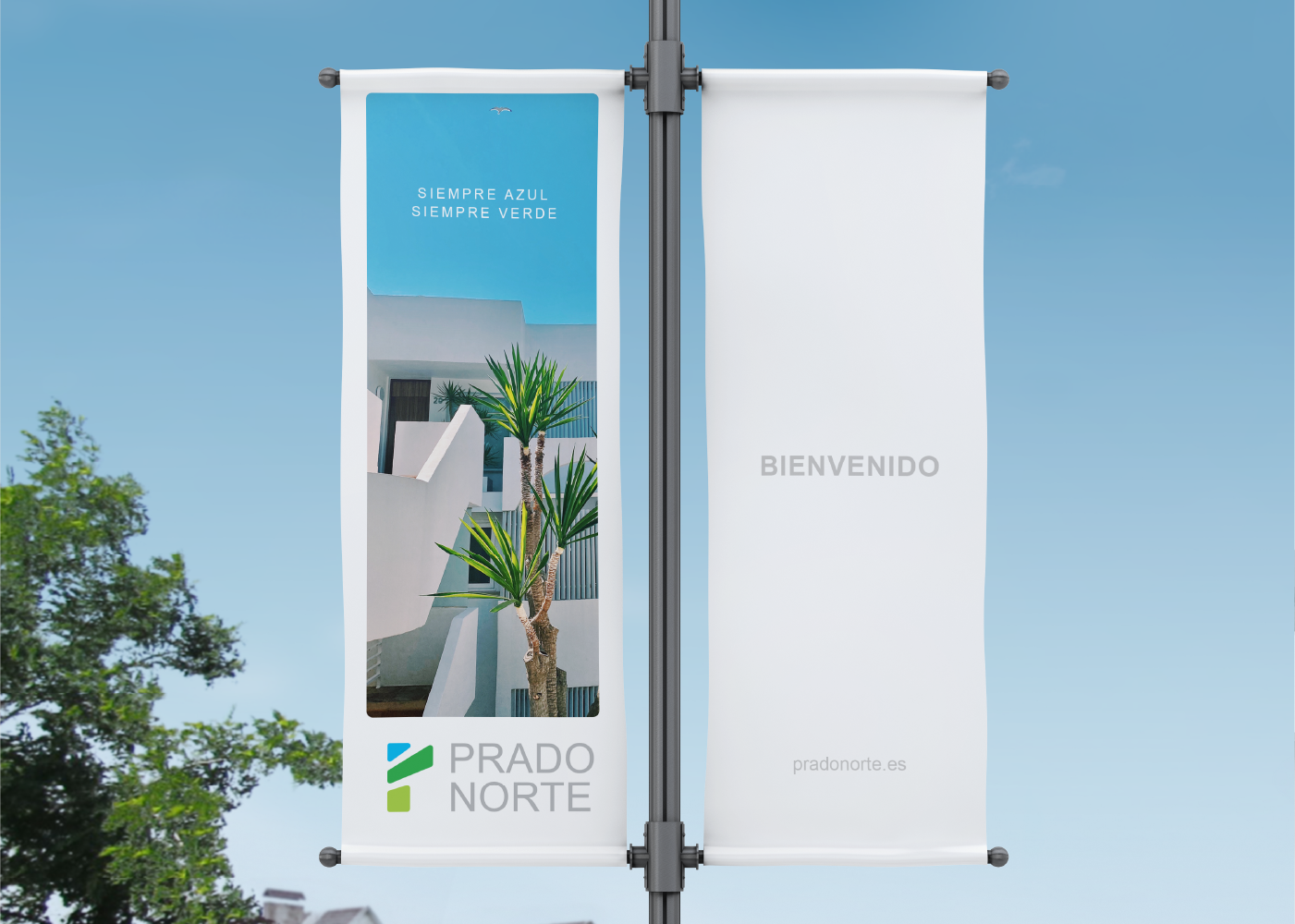
PRADP NORTE
Logo & IDENTITY Design
One of the projects of the Tirazis company is a villa complex near the city of Madrid. The letter “P” has been chosen as the first letter of the brand name, and an attempt has been made to inherit its overall identity from the main brand, which is the Tirazis company. In fact, the Tirazis logo evokes the letter “T,” and the Prado Norte logo evokes the letter “P,” and they share a similar design concept.
The brand’s color system reflects a multidimensional message.
i will keep 4 colors as the main color of the brand, colors refer to the theme of the brand Sky blue color represents clear sky and good air, dark green color represents trees and plants and pleasant environment of nature, gray color represents construction.
2022 - MADRID (SPAIN)


Your brand identity is the face of your business, and you want to put your best face forward for your audience.

